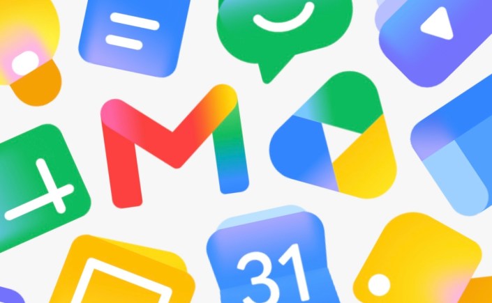
Lately, I have been noticing how many digital interfaces are moving toward softer gradients, glowing color transitions, and atmospheric visual effects. Because interface and logo design function rhetorically as much as aesthetically, these shifts are worth paying attention to not only as branding trends, but also as questions of accessibility and usability. A decade ago … Continue reading The Gradient Trend vs. Design Efficacy
The Gradient Trend vs. Design Efficacy