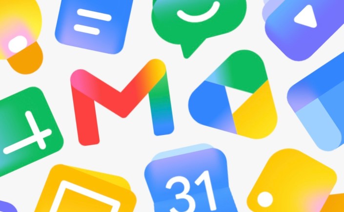
Lately, I have been noticing how many digital interfaces are moving toward softer gradients, glowing color transitions, and atmospheric visual effects. Because interface and logo design function rhetorically as much as aesthetically, these shifts are worth paying attention to not only as branding trends, but also as questions of accessibility and usability. A decade ago (gasp!), flat design displaced skeuomorphic realism as the dominant visual language of digital interfaces, favoring hard edges, clean geometry, and restrained color palettes over textured surfaces and dimensional effects. Recently, however, another shift has clearly emerged: gradients are back, and they are softer, blurrier, more atmospheric, and increasingly tied to the aesthetics of AI-era computing.
The recent refresh of Google Workspace icons is perhaps the clearest mainstream example. Gmail, Drive, Keep, and other products have transitioned from crisp segmented colors toward luminous gradients and translucent overlays. Similar tendencies can now be seen across interfaces from Apple, Microsoft, and countless AI startups whose branding relies on glowing spectrums, blurred neon transitions, and iridescent surfaces.
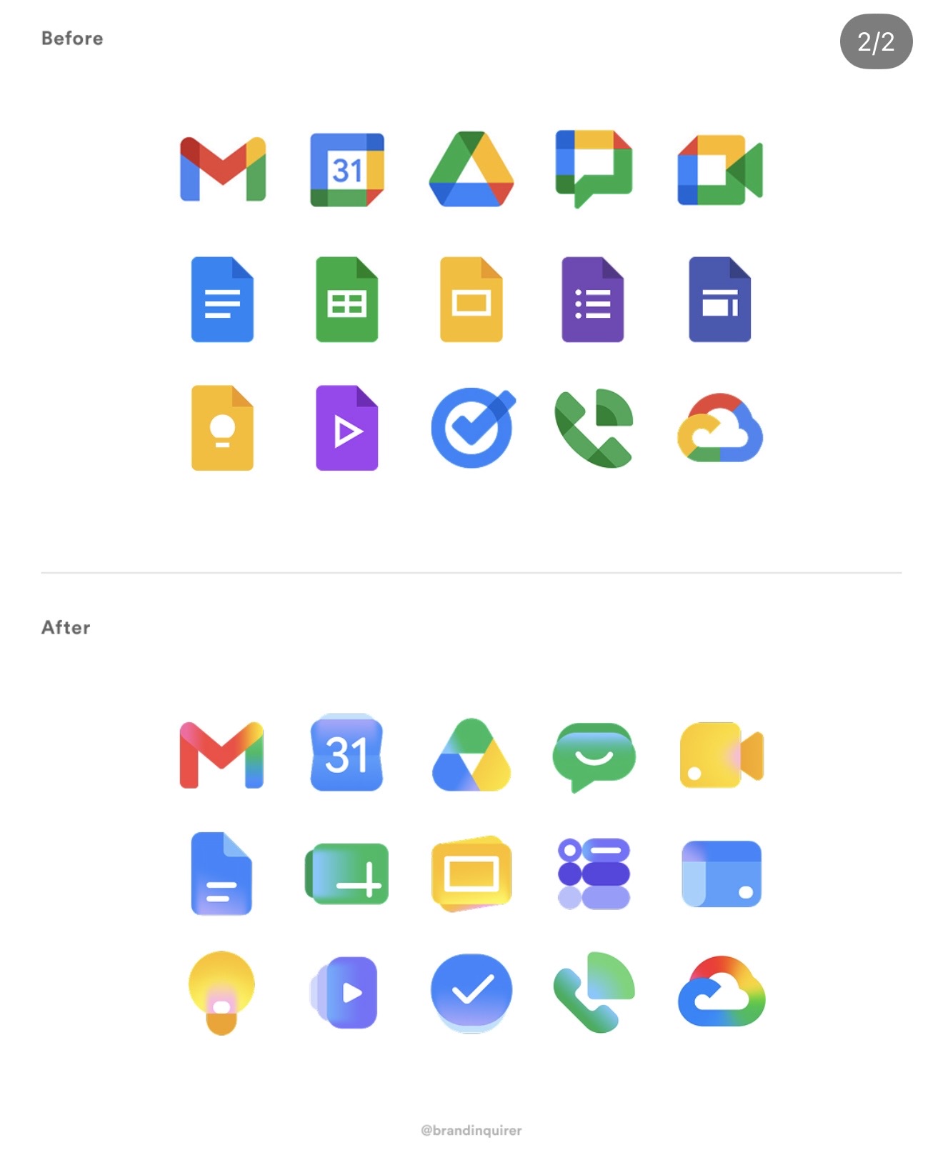
This is not merely an aesthetic trend. Gradients increasingly function rhetorically. This time last year, I discussed how gradients often signal an “AI inclination,” serving as a visual shorthand for intelligence, fluidity, adaptability, or computational sophistication. The gradient has become one of the defining symbolic languages of contemporary software culture. Much like skeuomorphism once communicated familiarity and flat design later communicated efficiency, gradients now communicate dynamic intelligence. They imply motion, responsiveness, personalization, and machine-assisted creativity.
At the same time, the growing dependence on gradients exposes tensions between aesthetics, accessibility, and communicative efficiency. Many gradient-heavy interfaces reduce edge distinction and contrast clarity, especially when paired with translucent effects, blurred shadows, or pastel palettes. For users with low vision, color perception differences, or cognitive processing challenges, these interfaces can become visually ambiguous. Flat iconography historically succeeded because it simplified recognition, whereas gradients often introduce uncertainty. For example, a button may appear decorative rather than interactive (like the Netflix example below), and an icon’s silhouette can dissolve into surrounding colors. Interface hierarchy becomes atmospheric rather than functional. Ironically, many contemporary interfaces now look beautiful at a glance while becoming less usable under practical conditions such as bright sunlight, small screens, tired eyes, or quick navigation contexts.

The problem with fading colors is not limited to usability. Gradients also create significant challenges for branding and graphic communication systems. Historically, strong logos were designed to survive translation across media environments, including monochrome printing, fax machines, receipts, embroidery, signage, and tiny digital thumbnails. Effective branding depended on recognizability under constraint. Gradient-heavy logos resist that adaptability because their distinctiveness often relies on luminous color transitions rather than durable shapes or forms. When converted into grayscale or pure black-and-white, many contemporary app icons lose much of their identity. Others collapse when reduced to favicon scale, stationery applications, presentation slides, or accessibility-first formats. In this sense, gradients frequently optimize for screen spectacle at the expense of communicative resilience.
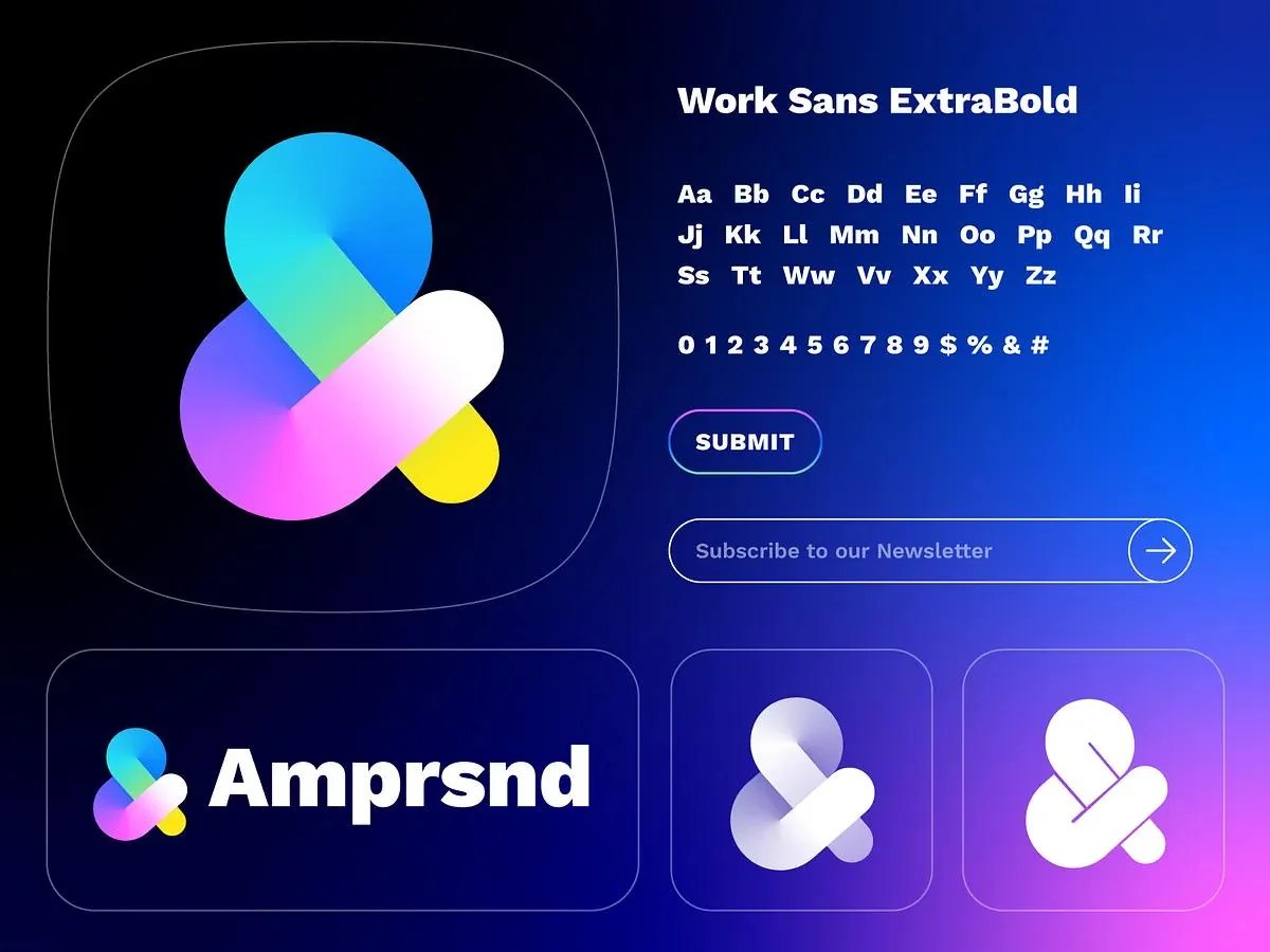
The mobile interface context partially explains why gradients are flourishing again. Smartphone displays are now exceptionally capable of rendering saturated color transitions, glow effects, and layered transparency. Consumers also increasingly expect interfaces to feel emotionally engaging rather than merely functional. Gradients soften interfaces that might otherwise feel sterile or overly corporate, and in crowded app ecosystems they create visual differentiation and perceived depth. This is especially visible in AI-related branding where gradients suggest emergence, fluidity, and creativity rather than rigid computation. Yet the logo/graphic communication industry may be drifting too far toward atmospheric design and away from informational clarity.
The issue, then, is not that gradients are inherently bad. Gradients can be elegant and emotionally resonant when used carefully. The concern emerges when visual trends become detached from broader communicative responsibilities. Good interface design must negotiate among aesthetic appeal, accessibility, scalability, recognizability, platform adaptability, and communicative efficiency. Designers today are understandably under pressure to create interfaces that feel contemporary, intelligent, and marketable, but contemporary aesthetics should not override usability fundamentals.
Perhaps the larger lesson here is that interface design should not merely follow visual culture but critically interpret it. The future of digital design likely lies not in rejecting gradients outright, but in deploying them more deliberately by preserving strong silhouettes, maintaining contrast integrity, designing for grayscale resilience, and prioritizing accessibility from the start rather than treating it as an afterthought. As digital interfaces continue drifting toward ambient, AI-inflected visual systems, designers may need to ask a deceptively simple question: are users still able to recognize, interpret, and trust what they are seeing, or are we increasingly designing primarily for visual mood?
More to explore:
- Gradients in logo design: Pros and cons (YouTube)
- The essentials of gradient logo design – with practical tips on do’s and don’ts
- A beginner’s guide to gradient logo design – with examples to help inform design decisions

