
Wow, just wow. I am flattered by the jump in viewership that happened overnight after I blogged about why the latest Apple iPhone keynote is rhetorically deficient. Not to jump on the bandwagon but I would like to take this chance to explain why I maintain my argument and so-called cynical viewpoint on the new launch.
While the new iPhone 5S is all well and great, 5C simply represents a revolutionary move that Apple has never before taken – go cheap. Okay, a better term would be affordability, or making iPhone more economical. Yet, never once in the keynote last night that SVP Phil Schiller mentioned about making iPhones more available for everyone. Really, maybe I am missing it, but what is the selling point of 5C? Go around and ask those who would like to get a new 5C: Are they going for the colors or the price? TechCrunch admits that the C in 5C stands for “clueless.” And I second that. An unclear marketing objective is suicidal to the company and product, especial for big players like Apple.
If you are among those who are attracted by the new color options in 5C, I urge you to think again. Look at the comparisons below and choose for yourself the better “looking” device.

The black logo on the polycarbonate, colored cover is a bad visual design. The only two that look okay-ish are white and yellow.
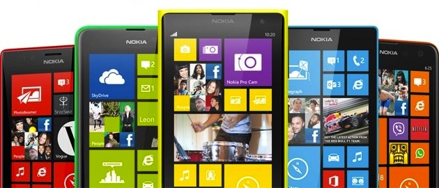
Indeed, imitation is the best form of flattery (for the competitor). Worse is when you didn’t do a better job than you have intended to. Speaking about integrating the OS interface design to the cover, Apple didn’t do as good of a job compared to Windows, IMHO.
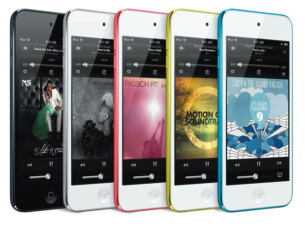
Even their own iPod Touch is much better looking than 5C!

Like, seriously better looking, from any angle!
Ultimately, it comes down to the craftsmanship of the final finish. At this point of the blog I am already disgusted by the way Apply presents their new colored toy. Scroll down and see for yourself how they did it better in 1998 than in 2013.


It’s time to think different, Apple.
