
Google has just updated its “G” favicon logo. This is its first major change in a decade (although it doesn’t really feel like that long ago when the Alphabet subsidiary evolved from its Catull serif face to the sans-serif Product Sans typeface). This new update is subtle: the four distinct primary color segments have been replaced with a smooth gradient. At first glance, it may seem only cosmetic. But small interface updates like this often carry larger signals about where a platform is headed and how it wants to be seen.
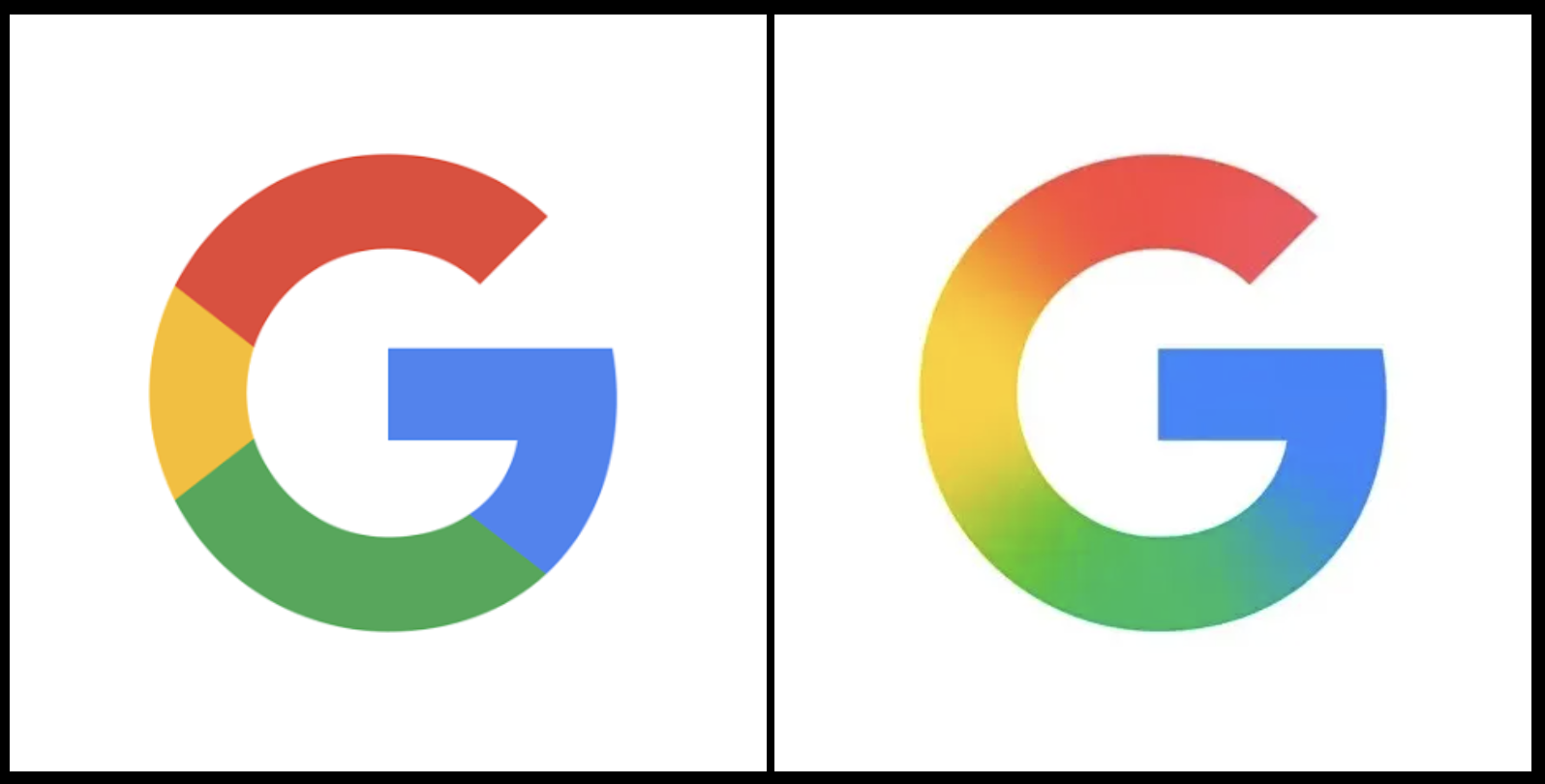
As someone who studies and teaches design, I pay attention to changes like these. It’s not because I’m interested in brand aesthetics per se, but because design changes are rarely just visual. They’re also rhetorical. They shape perception, communicate direction, and invite certain kinds of user expectations. In this case, Google’s gradient aligns visually with its broader integration of AI technologies—Gemini, in particular. It’s a cue that the company wants to be understood as seamless and adaptive.
What interests me here is less the logo itself and more the ripple effect: how even a modest visual change intersects with user experience, accessibility, metaphor, technical infrastructure, and rhetorical positioning. I’ve been thinking about these relationships as part of a kind of design ecology—a system where nothing functions in isolation.
So, as a thought exercise I mapped out six interrelated layers that influence and are influenced by interface design in this case:
- Design & aesthetics: the visual surface
- Rhetoric: what the design communicates
- Metaphor & meaning: how design cues connect to ideas and expectations
- User experience: how users navigate and interpret the interface
- Accessibility: whether and how the design works for diverse users
- Technical application: how it performs across devices, contexts, and infrastructures
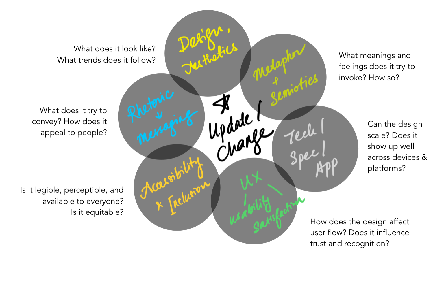
At the center is the design change itself, but surrounding it are systems of influence, some visible, others not. A gradient may not seem like much, but it’s often where aesthetic judgment meets infrastructure, brand identity meets user perception, and rhetoric meets technical constraint.
These intersections matter, especially when we think about how people experience technology unevenly. What looks sleek on a flagship phone may be illegible on an older device. What blends beautifully for one user may pose legibility challenges for another. What feels “intuitive” often rests on a history of cultural defaults that don’t hold up across contexts.
For me, design is most interesting when it opens up these kinds of questions, i.e., when it asks us to notice how meaning, access, and experience are all entangled.
While the new logo may succeed rhetorically and visually in high-resolution, color-rich environments, I also think about its material usability: Would this gradient hold up on small-scale stationery? On low-resolution printouts? In black-and-white or grayscale contexts where color blending loses its nuance? Designers working with gradients often face challenges when adapting to monochrome outputs—there’s no clear “middle tone” to default to. So translation becomes a design problem in itself: how do you preserve recognition and meaning when the original affordances aren’t available?
In that sense, a redesign like this doesn’t just signal a shift in aesthetic—it also brings with it a series of decisions about scalability, adaptability, and translation. These are technical and rhetorical choices, and they matter just as much as color theory or trend forecasting.
So yes, Google changed its logo (the favicon, for now). That’s not the story. The story is what that change touches, and what it reveals about the systems we design within.
